The destiny of your web content is decided in the few seconds it takes a visitor to determine if it meets their unique needs. These needs can be satisfied or not, depending on how much effort you’re willing to put into it — and it is worth the effort because Google knows how to recognize user frustration and penalize it and also how to recognize user satisfaction and reward that.

Why Is User Experience Important?
An outstanding user experience (UX) will help both your KPIs and your search engine optimization (SEO). User satisfaction is a ranking signal. We know this partly because Google has told us so, and partly because most Google algorithm updates over the last six years have focused on it.
If you want to bring a “user-first experience” to your SEO efforts, there are five areas you can focus on for quick wins. Let’s look at each one.
1. Content Structure
Properly structured content keeps users from getting stalled and leaving because it guides their eyes, enabling them to quickly find what they came for. They can skim to what they want and read it — making the most of those critical first few seconds on the page.
Think about a supermarket. Aisles and sections are clearly labeled and can easily be read. Products are organized logically in a way that makes sense to humans. It’d be very difficult to shop for fruit if strawberries, blueberries, and raspberries were mixed together loosely in one location. It’d be even more difficult if some fruits and vegetables were located in the pet food section and others were located in the bakery aisle.
In the same way, content structure helps your visitors understand what they can find and where. Your page subheadings, lists, and visuals make it easy for them to land quickly in the right spot on the page. In addition to being user-friendly, content structuring is a very practical SEO practice. Google knows how to recognize poorly-organized content and well-organized content.
Four elements show Google and other search engines how well your content is configured with the user in mind:
- Page Subheadings Provide a Hierarchy for Topics and Sub-topics
Subheadings help users quickly gain a high-level understanding of the subject matter and help Google evaluate the logical presentation of the content. Each page should have only one unique H1 heading that encapsulates the main topic. H2 through H6 headings should be used for subtopics in order of importance from most to least. Skipping hierarchy levels makes it harder for search engines to understand and for vision-impaired users to follow, giving them a poor experience. - Bulleted and Numbered Lists Within Content Make It Easier for Users to Scan and Read
Google has recommended ways to use both bulleted and numbered lists. Bullets are for items that are not in sequence and don’t contain options. Numbers are used when the items need to be ordered exactly as they are listed. Google recommends introducing lists with a complete sentence, although most style guides say that an incomplete sentence may be used as well. - Visuals Provide a Rich Experience and Draw Users’ Eyes Down the Page
Images, infographics, charts, and graphs engage your audience quickly, illustrate content, and increase the amount of time visitors spend consuming your content. Selecting the right visuals is an easy, high-impact way to capture user attention. By prioritizing user experience, it ends up helping SEO by increasing engagement. - A Logical Site Architecture Allows Search Engines to Understand Your Topics
Your site architecture is an important way for Google and other search engines to understand the topics which you have expertise on. It also allows users to browse with confidence that they’ll be able to find what they need.
Two Examples Showing the Importance of Content Structure
Take a few minutes to review the examples below to see the difference that good content structure can make. You can see how two blog posts on a similar topic, “Integrated Marketing,” from AdRoll and Leadspace compare.
Ask yourself:
- Which page provided the best experience?
- Which page was easiest to scan?
- Which page made it the easiest to consume good content?
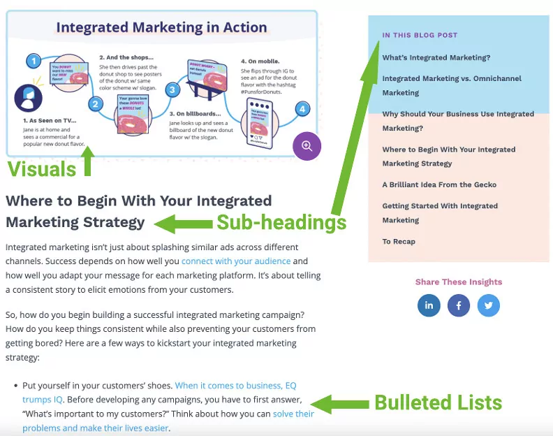
AdRoll Example
Leadspace Example

The AdRoll article uses subheadings so readers understand the order and hierarchy of the subtopics, bullets to make it easy to skim a list of action items, and visuals to illustrate complex information. It should be no surprise that the AdRoll article performed better in organic search (ranking on page 1 in Google) than the Leadspace article (ranking on page 4 in Google) at the time this article was published.
In summary, if visitors to your website cannot find what they need easily, it’s not their fault. It’s yours, and your search results will suffer for it.
2. Usability
Bewildered users bounce. Imagine you’ve set out on a hike into new terrain. You would become disoriented if you couldn’t locate yourself relative to your surroundings, trail signs were missing, there were multiple opportunities to take a fork in the road, and no one to ask for directions.
Don Norman, the founder of the Nielsen Norman Group, says that “complexity is essential: it is the confusion that is undesirable.” The role of the website owner is to eliminate confusion, or at least minimize it as much as possible. Lack of focus, the inability to orient oneself, and unclear naming can cause your visitors to go around in circles.
These tactics can help you reduce confusion and provide a better user experience:
Inclusion of Breadcrumbs
Breadcrumbs have two jobs. The first is to help visitors understand where they are on your website for UX and the second is to send link equity to your more important pages for SEO. Especially on larger websites, it’s easy for people to lose track of where they are, get lost, and leave. Breadcrumbs provide a navigation snippet that allows users to move back up in the hierarchy if the page they’re on isn’t what they wanted. You’ll want to ensure that your site has breadcrumbs and your pages are named in a logical way that’ll make sense to your users so they’ll be less likely to become confused and leave your site.
Use of Accurate Labels
Labels help users predict what they’ll find when they click on a link. While SEO teams often prioritize keywords in anchor text, providing users with an “information scent” – “cues that they get from the link label and the context in which the link is shown” – is more important.
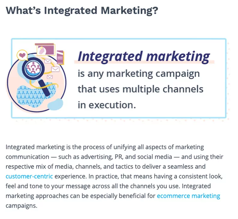
In the AdRoll article example above, it uses the anchor-text “customer-centric” to link to a blog on “Customer Marketing,” a fairly accurate label — prioritizing readers versus search engine spiders.
Meanwhile, the Leadspace article example uses SEO-optimized anchor text “integrated marketing strategy” to link to what was probably once a blog post on “Cross-channel Marketing.” That link now redirects to the blog homepage, which doesn’t align with what users are expecting. When SEO is at odds with UX, let UX win.
Writing on a Focused Topic
Trying to be “all things to all people” dilutes the focus of the page and makes it harder for users to zero in on the answer to their questions. Highly-focused pages perform better in organic search results because people want information that closely relates to their search query. If they’re searching for “home beer brewing instructions,” they don’t want to find content on “opening their own distillery.” While we know it’s good to provide comprehensive content on a topic, that thoroughness should be disciplined so that it answers all the reader’s closely-related questions without distracting them with “shiny objects.”
Providing Answers to Questions
This approach allows readers to stay focused on their goals and provides an opportunity for the page to win a featured snippet (position zero in Google) or an answer to a “People also ask” question. By answering questions that others don’t, you can increase your visitors’ satisfaction while increasing your own likelihood of attracting more organic traffic.
Let’s compare two articles on the complex topic of “defi and finance” to see the difference that page usability makes:
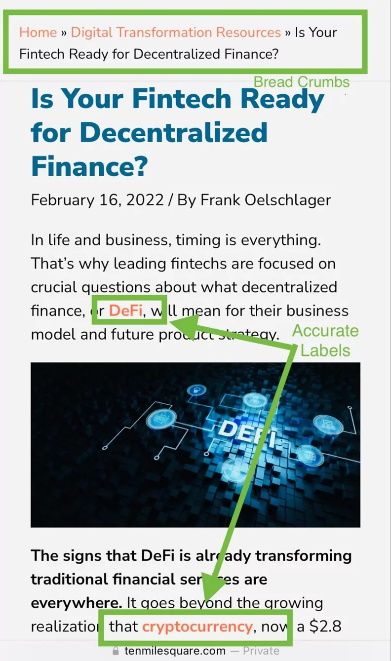
Ten Mile Square Example
“Is Your Fintech Ready for Decentralized Finance?” is an in-depth article written by a subject-matter expert. It contains breadcrumbs and clearly labeled links to definitions, answers the most commonly asked questions about the topic and is tightly focused on its topic. It ranked on page 1 in Google for “defi and fintech” shortly after it was published.
IMF Example
“Fast-Moving FinTech Poses Challenge for Regulators” uses most of the space above the fold for an oversized image, forcing the user to scroll to get to something they can read. There are no breadcrumbs. The article gives cursory treatment to topics that don’t appear to be related at first glance and do not explicitly answer readers’ questions. Even though it is authored by the International Monetary Fund, it ranked on page 4 for “defi and fintech” when this was published.

If users are confused because you haven’t paid attention to usability, they will look for answers elsewhere, and your website performance will suffer.
3. Activity-focused Design
People like to experience a feeling of accomplishment as quickly and easily as possible. This translates on the web into a kind of hunting behavior. Users scan for what they want and click on the first link that looks promising, continuing to click until they reach a page that allows them to achieve their goal.
Activity-focused design is the process of organizing steps and tasks in a defined activity so that visitors to your website can achieve their goals. In almost every instance, your efforts to facilitate their ability to accomplish their objectives will translate into more organic traffic for your website. The good news is you can help your users accomplish their goals with minimal effort. Paying attention to the following considerations can really pay off:
Create Clear Pathways to Help Users Get from Point A to Point B without Frustration
A high bounce rate can sometimes be an indication that your visitors don’t know what to do next and that their goal-seeking behavior has been thwarted. Taking the time to understand what users are trying to accomplish on your site and giving them clear next steps will pay off in a lower bounce rate, increased time on site, and more pages visited — all metrics that make SEOs happy.
Research and Use Words Users Are Looking For
In the first few seconds after users click your search result (SERP) link, you’ll want to use the keywords that they’re looking for so they realize they’re in the right place. You can get this information from Google Search Console and from polling your audience. Their queries give you insight into the workings of their mind and their expectations when they land on your pages. Ensure that these words and phrases are prominent in the title tag, meta description, heading, and first paragraphs. It will give visitors a head start on accomplishing their goals and be good for your KPIs as well.
Develop Content Hubs Allowing People to Expand their Knowledge Beyond their Query
Everyone has things they don’t know that they don’t know. Humans aren’t very good at identifying gaps in their own knowledge. Presumably, one of the reasons you have a website is that you are an expert at something. By organizing your expertise, in the form of content, into logical buckets or hubs linked together in a way that allows readers to explore new topics; you give people the opportunity to educate themselves and better accomplish their objectives.
Provide Fast, Friction-free Conversions for Downloads, Email Sign-ups, and Purchases
It ensures that people can be on their way quickly with a good taste in their mouths. It’s also one of the best ways of encouraging visitors to return to your site again. Ecommerce sites should invest in the checkout experience. The internet is cluttered with shopping mediocrity. Once you get a customer to your site, you want to keep them, convert them, and have them remember you the next time they need something.
Pay Rigorous Attention to Your Mobile Experience
User engagement is the driving factor in mobile web use so your pathways and conversion pages must be mobile-friendly. The images below show a stark difference in the mobile ordering experience of two fast-mex food competitors.
Brand loyalty aside, which restaurant makes it easier for you to order dinner before leaving the office? If your visitors can’t get from start to finish on their mobile devices without hiccups, make it your #1 priority to remedy that situation.
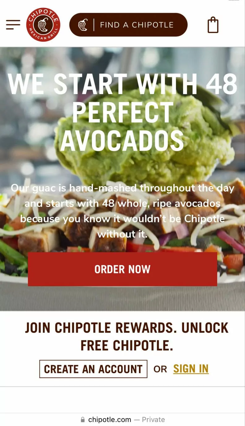
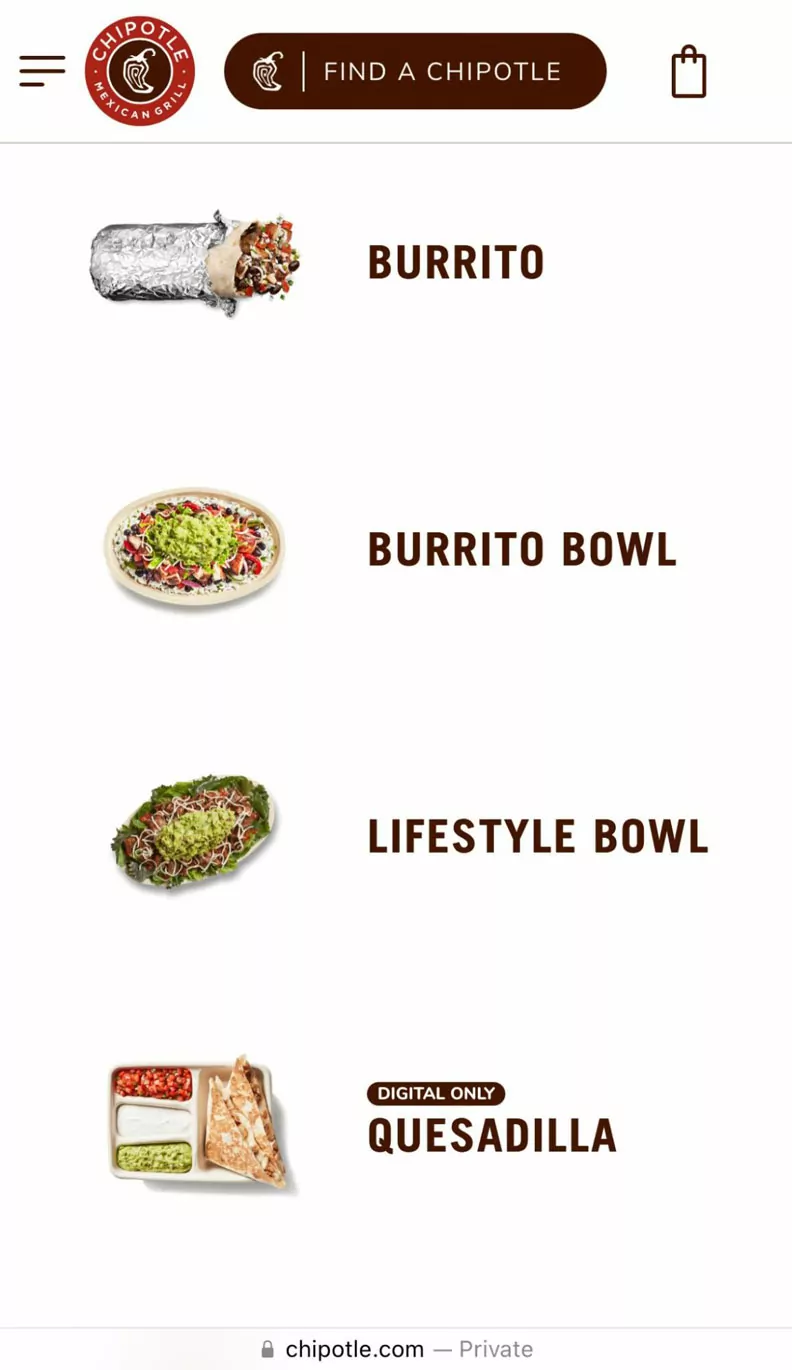
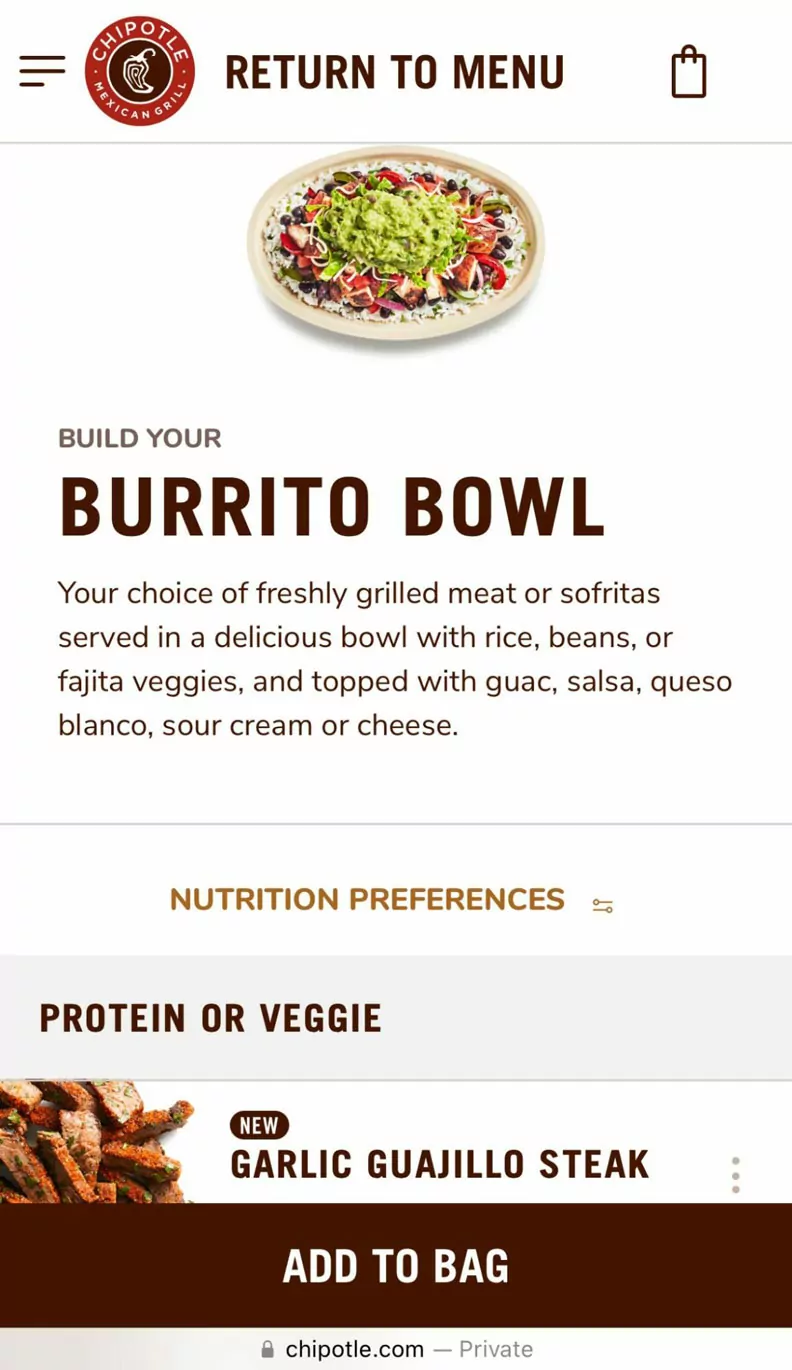
Chipotle Example
On the mobile landing page, a user who wants to order dinner quickly can easily see where to start with “Order Now.” On the second screen, the user can see four of the six main menu items at a glance and scroll easily to the remainder. Once a menu item is chosen, a zip code has been entered, and a store selected, the customization options are clear and painless to select.
| Homepage | Step 2 | Step 3 after entering zip code and selecting a location |
 |
 |
 |
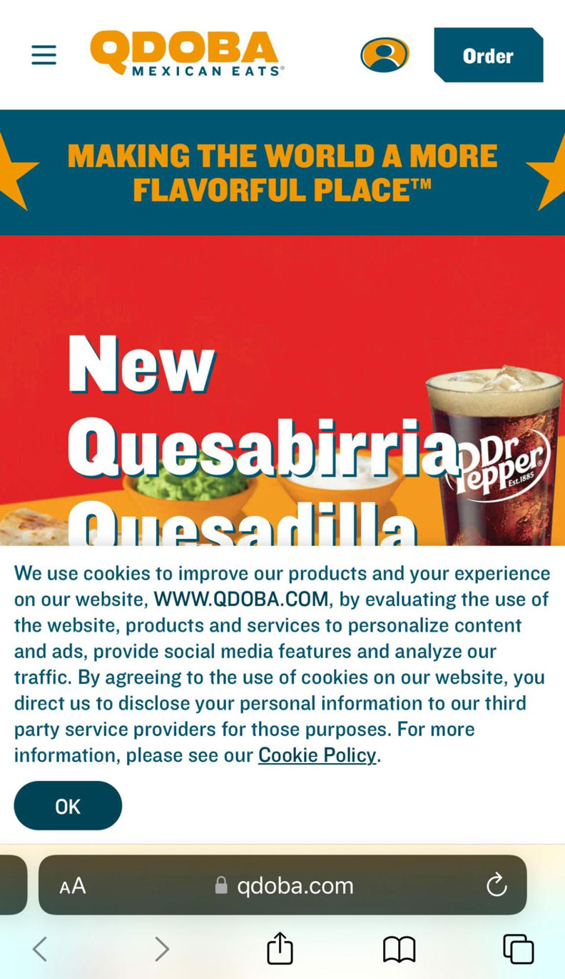
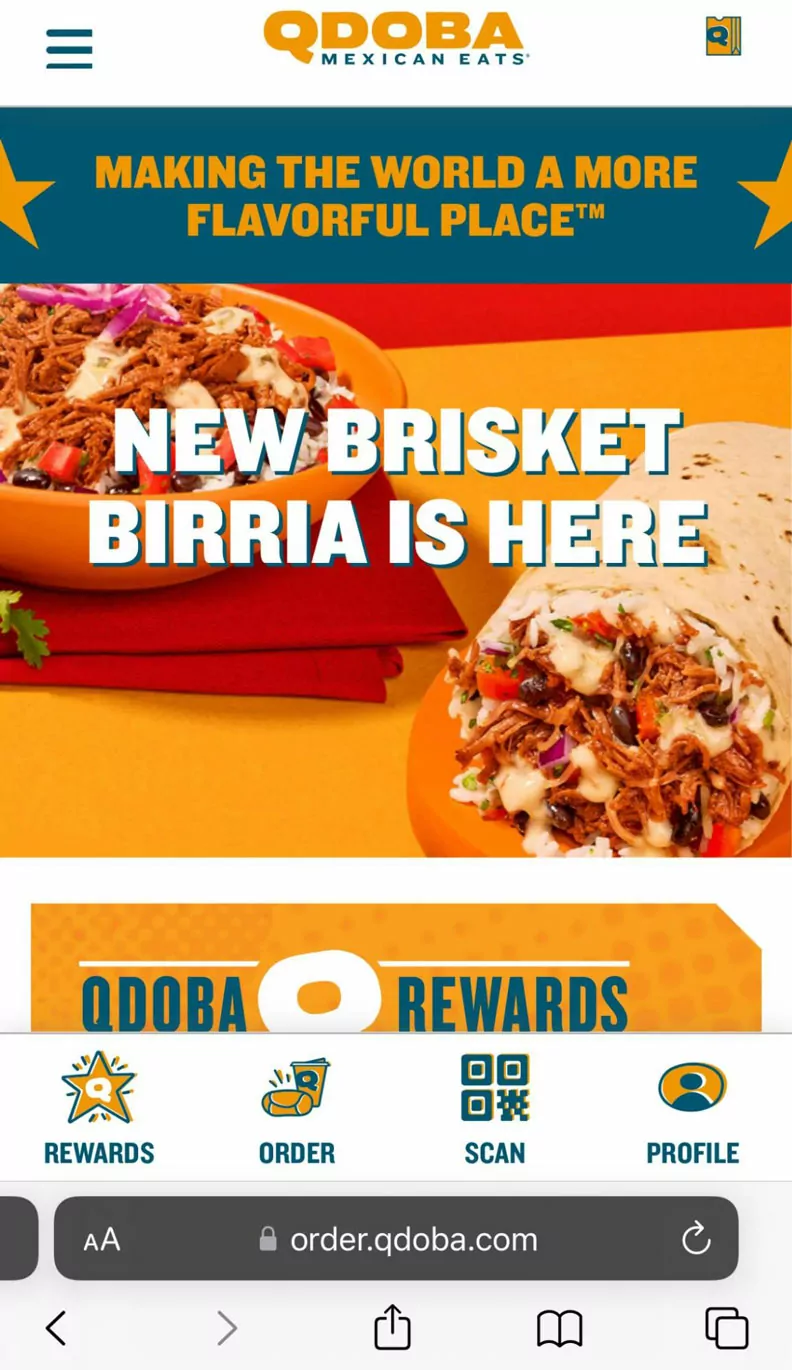
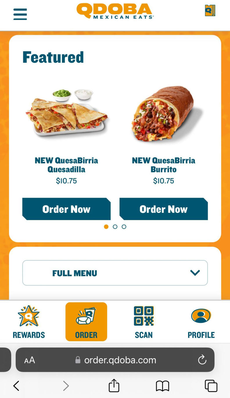
Qdoba Example
Half of the content on the mobile landing page is covered up by a pop-up on page load. After the user clicks to remove it, a slideshow of three promotions is presented. Only on the second promotion are they prompted to “Order Now.” On the second screen, the user has to scroll to place an order. On the third screen, the user has to scroll again to see the full menu.
| Homepage | Step 2 | Step 3 after entering zip code and selecting “start order” |
 |
 |
 |
4. Accessibility
About nine years after the passage of the Americans with Disabilities Act (ADA), the World Wide Web Consortium published its first version of the Web Content Accessibility Guidelines (WCAG). The guidelines have been regularly updated over the years and are the standard for ADA web compliance.
Excellent user experience includes making accommodations for people with:
- Physical disabilities that hinder their movement, hearing, or sight
- Cognitive disabilities that hinder their reading, watching, listening to, or understanding of content
Disabled users send the same quality experience signals to Google that non-disabled users do. If you want your web pages to perform their best in organic search, you can’t afford to ignore any segment of your audience. The only difference is the factors that contribute to a great experience.
While there are many ways for websites to be accessible, there are at least five where providing a good user experience can also improve your position in the SERPs: alt text, image file names, headings, color contrast, and audio and video consumption.
Alt Text is the Language that Describes Images on Your Page
It’s read to visually impaired users by screen readers. As such, it needs to accurately describe the image so that it can be pictured in the reader’s mind and fit in with the context of the copy before and after it. Alt text is not there as an extra place for targeted keywords. If you are unable to describe the image with language that harmonizes with the main topic of your page, consider that you might not have chosen the best image. According to WCAG, accessibility means providing “text alternatives for any non-text content so that it can be changed into other forms people need, such as large print, braille, speech, symbols or simpler language.” Even if alt text had no SEO value, it’d still be a necessary element.
Image File Names Rarely Receive the Attention They Deserve
Perhaps this is because it is difficult for a sighted person to understand why it matters. If you publish an image with a numeric or incomprehensible file name, the screen reader reads it exactly as it is. In contrast, a descriptive file name combined with clear alt text helps visually impaired users understand the image in context with the rest of the page, just as sighted readers do.
Headings Organize Content and Make It Easier for Sight-impaired Users to Navigate
They also help people with cognitive disabilities understand the big picture of your topic. The proper use of headings is easy. Each page should have one unique h1, and h2 through h6 tags should be used in an unbroken chain to identify subtopics within larger sections. Properly used headings may be a weak signal for Google but they are a strong signal for people who need to use screen readers or have learning disabilities.
Color Contrast Makes Reading and Scanning Easier
It is especially important for users who are colorblind and those with low vision. A contrast ratio of at least 7:1 should be used for both text and images, not including logos, large text, and incidental elements.
Consuming Audio & Video Can Be Difficult for People with Vision, Hearing and Cognitive Disabilities
WCAG recommends providing “static alternative non-media content that is not time-based.” One of the easiest ways to do this, in a way that’s good for both UX and SEO, is to publish a transcript of the content on the same web page as the audio or visual media. This way the search engines know what’s on the video and users with disabilities can easily consume the content.
In the video below, a professor from UCSF, who is also blind, explains how a screen reader works and demonstrates what happens if even small accessibility features are ignored. You can hear how he uses heading tags to “scan” the content, what happens when descriptive image file names and alt text aren’t used properly, and why it’s important for tables to be set up with the correct html tags.
Everyone deserves access to the knowledge and opportunities that are available online and everyone should be able to achieve their goals online. Making your website accessible is the right thing to do and should be done even if there is no obvious benefit. But, doing things for the right reasons often pays off in ways you may not expect and, in this instance, could include better rankings.
5. Page Experience
Technical SEO and UX intersect with “page experience.” Page experience covers page speed, mobile friendliness, interstitial design, and Core Web Vitals (CWVs).
Core Web Vitals include:
- Largest Contentful Paint (LCP) measures loading performance
- First Input Delay (FID) measures interactivity
- Cumulative Layout Shift (CLS) measures visual stability
Page experience factors are explained in more detail in this Google blog post from 2020 titled, “Evaluating page experience for a better web.” Hundreds of thousands of words have been written about page experience — especially Core Web Vitals, yet we encounter websites every day with frustrating user experiences. If knowing what to do is not the problem, then what is?
We commonly see three reasons websites continue to struggle with poor page experience, even when they know they shouldn’t: lack of skill, lack of will, and prioritizing the wrong activities.
Lack of Skill
Page experience issues, particularly Core Web Vitals, can be tricky to fix — especially on WordPress sites. Plugins are notorious for delaying the amount of time a visitor can interact with content on the website, a strong factor in user dissatisfaction. Web designers who are outstanding at visually bringing a brand to life are often out of their depth when it comes to making the technical changes that improve page experience. They may not even realize there are problems until the performance of the website suffers, an analysis is done, and the issues surfaced.
Lack of Will
Troubleshooting and fixing Core Web Vitals and other site performance issues is a slog through the bog. There are tools that can accurately identify the problem and get granular with action items; but, invariably these fixes require time, concentration, and attention to detail. It can be hard to conjure up the motivation but it is necessary.
Prioritizing the Wrong Activities
When the right fix is difficult, time-consuming, and expensive, it’s tempting to wonder if you can simply improve other website ranking factors such as on-page optimization, site structure, or content and it will be enough for Google. Maybe your efforts in these areas will be so good that the search engines will just ignore the fact that page loading time is slow, users can’t interact with your web page quickly, or that an element shifts just as it is being clicked. They won’t. Great content can be torpedoed by poor Core Web Vitals. Site structure has its own contribution to user experience, but it can’t overcome a bad page experience on its own. And on-page SEO is the frosting on the cake for an outstanding page experience, not the other way around.
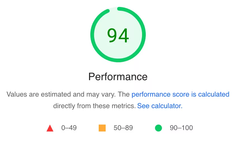
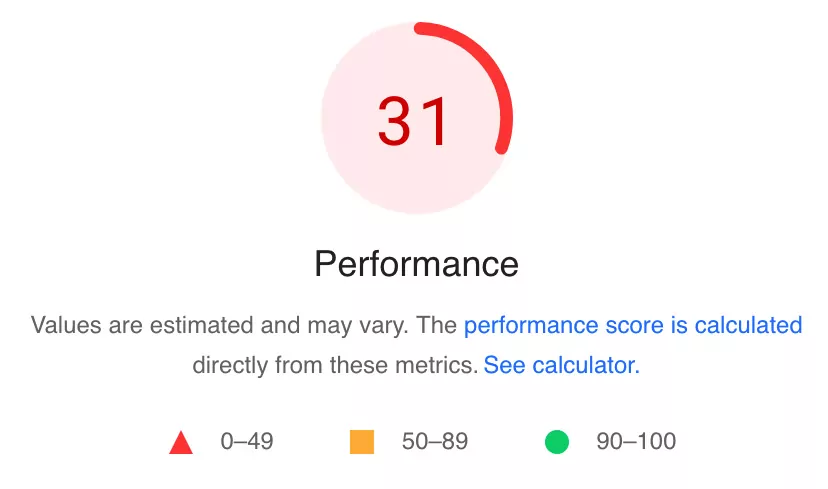
Let’s look at a couple of examples without naming names. In the world of web production, there are a number of sites that produce content for developers, designers, UX practitioners, content strategists, and others in the field. One site consistently outranks its competitors for the same topics. While there are many factors that contribute to high rankings over time, this site’s page experience and Core Web Vitals scores (figure on the left) are certainly helping compared to a similar site (figure on the right).
Page Experience Scores from Page Speed Insights
If your page experience sucks, so will your search engine optimization. Find the “skills” and the “will” you need, prioritize these important ranking factors, and watch your results improve.
The first response of many search strategists in whatever analysis they’re doing is to talk about ranking factors, strong signals, weak signals, and whether or not Google really cares about the current thing. Current things come and go, but user experience is forever. If a decision is the right one for great UX, it doesn’t really matter if it’s a ranking factor, how strong the signal is, or if it’s currently on Google’s radar. Yes, you can move forward with confidence that Google understands and rewards a great experience, even if you don’t quite know how they do it. And yes, you can even have a relative degree of confidence that if it’s not now part of the algorithm, eventually it will be. But, even if it’s not, and never will be, prioritizing your users is the right thing to do, and will bring you success in the long term.
Have you tried everything, but still can’t get your webpages to rank? Let Atigro help you get to the root of the problem. Contact us to learn about our expert-led SEO Audit.